Duende is an Art Gallery that exhibits artworks, collections and installations of artists from all around the world. Users are more than welcome to visit the Gallery or virtually attend an event or an exhibition using the Gallery’s Audio Tour App + Features.
Target Audience
People who live in cities of Greece with great art interest and who would choose to use an audio-tour app over a real art gallery guide.
This product also addresses to people with different abilities, of different gender, educational level and/or occupations and industries.
My Role
UX Designer
UX Researcher
Leading the Duende’s Gallery
Website Design
My Responsibilities
• Do User Research • Create Personas Build Problem Statements • Create User Journey Map Wireframing • Conduct Usability Studies Designing Mockups • Lo/Hi Fidelity Prototyping Iterate on Designs • Responsive Design
The Goal
Design a website to be user friendly and motivate users to visit the Gallery without having second thoughts.
Challenges
1: The burden of large groups 2: The limitation of having to schedule with a real guide 3: The tight schedule and obligations in everyday life and routine.
Design Process
When it comes to the UX Design, it’s important to accept that it will never be perfect. Design is an iterative process and usually there’s a lot of back-and-forth. There’s no one-size-fits-all solution, but you can always use what works best and get rid of the rest!
Empathize Define
User Research
User Interviews
Personas
Personas
Empathy Maps
User Journey Maps
Ideate
User Flow
User Stories
Crazy 8s
Sitemap
Design
Wireframes
Lo-Fi Prototypes
Visual Design
Mockups
Hi-Fi Prototypes
Test
User Research
Usability Studies
Feedback
Insights
Design Iterations
Empathize & Define
User Research
I conducted interviews and created empathy maps to understand the users I’m designing for and their needs. The participants for this research were people of different age, gender, educational level and economic status. People with disabilities or other daily obstacles were also taken into consideration.
I discovered that the challenges which prevented users from hiring a real guide included the cost, the burden of large groups or other factors that could be a distraction. Furthermore, the research showed that closed captions and additional images are essential not only for people with disabilities, but for any user.
In addition, I discovered that many target users often have second thoughts on visiting an Art Gallery and engaging in Art in general, due to everyday obligations and tight schedule. This causes a normally enjoyable experience to become challenging for them, defeating the purpose of relaxation and mindfulness through Art.
PAIN POINTS
Cost
Renting devices or book a tour guide can be expensive.
Customer Service
Many of this kind of websites don’t provide in-depth information, any updates or the ability to receive a quick response in any question.
Flexibility
Due to daily obligations and rigid schedule, many adults don’t have the time to visit in person the gallery.
Accessibility
Websites are usually not equipped with Assistive Technologies and don’t take into consideration any permanent or temporary disability.
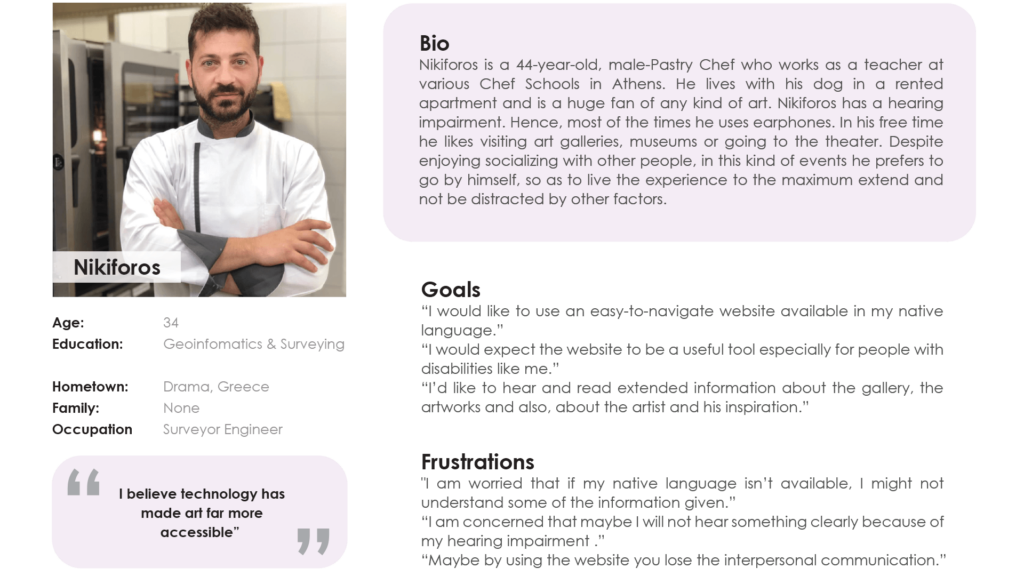
Persona
Crazy 8s
There’s no such thing as crazy here! I set the timer and felt completely free and unbiased while sketching. The point was to deliver the ideas that quickly came to my mind, so as to solve specific user pain points.
8 minutes! Ready, set, go!
Initial Concepts
Virtual Tour – Mapping of the Gallery
“Remember to” List
Personal Guide – Select Voice
Online Chat
Download Audio – Listen offline
Read Transcript – Contrast
Reminder to receive notifications for upcoming events
Customizable user interface – Choose themes / colors
After carefull evaluation of the Initial Concepts I decided to move forward with those marked with a star.
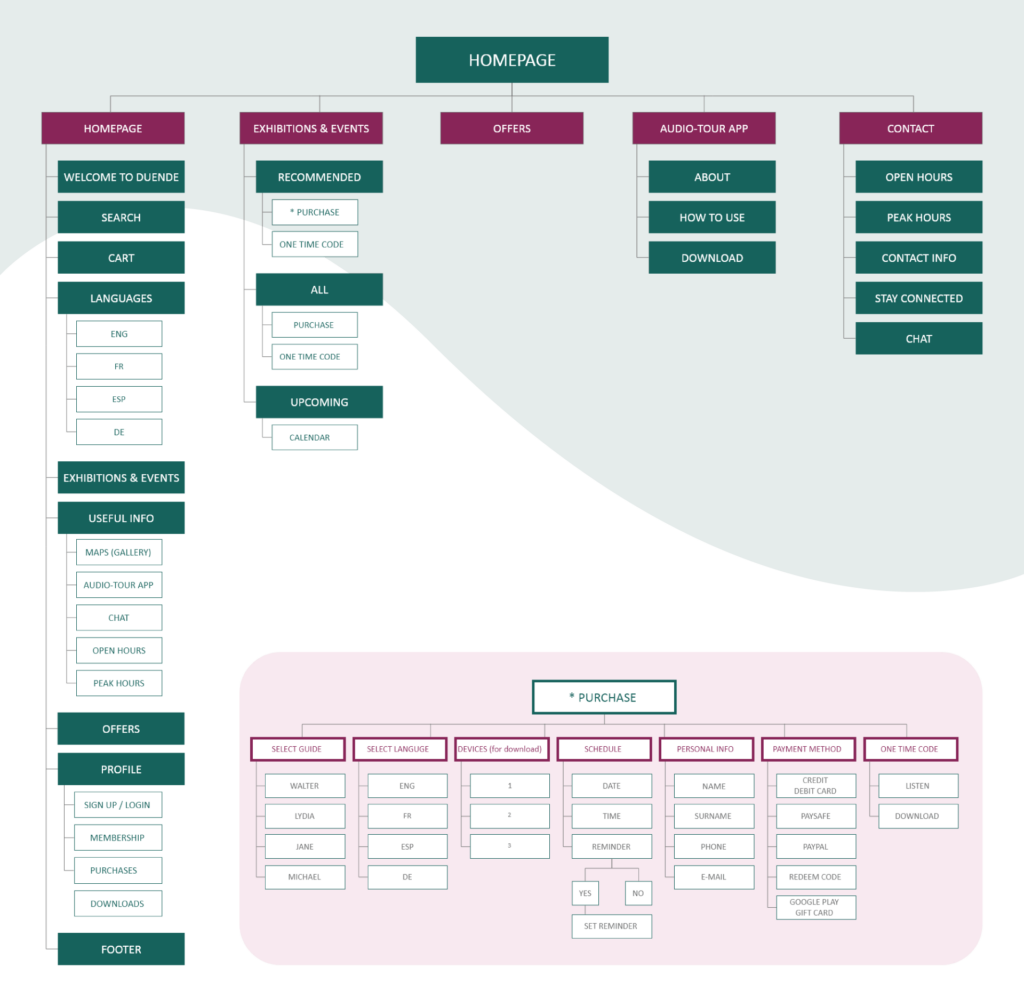
Sitemap
I thoroughly began to analyze the most important information that needed to be highlighted. I organized the content into a clear and logical sturcture that would make it easy for users to find what they’re looking for.
Design | Test
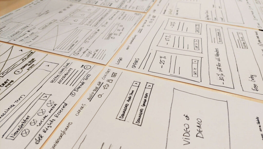
Paper & Digital Wireframes
Next I sketched out paper wireframes for each screen in my website, keeping user pain points about navigation, booking a guide, scheduling an event and checkout flow in mind.
Taking the time to draft iterations of each screen I designed on paper, ensured that the elements that made it to digital wireframes would be well-suited to address user pain-points.
Because Duende’s Art Gallery customers/visitors access the website from a variety of different devices, I started to work on designs for additional screen sizes (mobile + tablet screen) to make sure the site would be fully responsive.
Moving from paper to digital wireframes made it easy to understand how the redesign could help address user pain points and improve user experience.
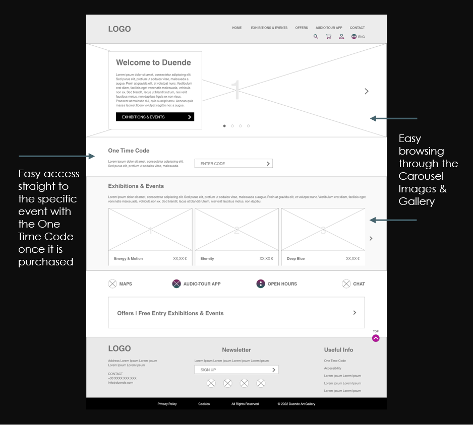
Prioritizing useful button locations and visual element placement on the home page was a key part of my strategy.
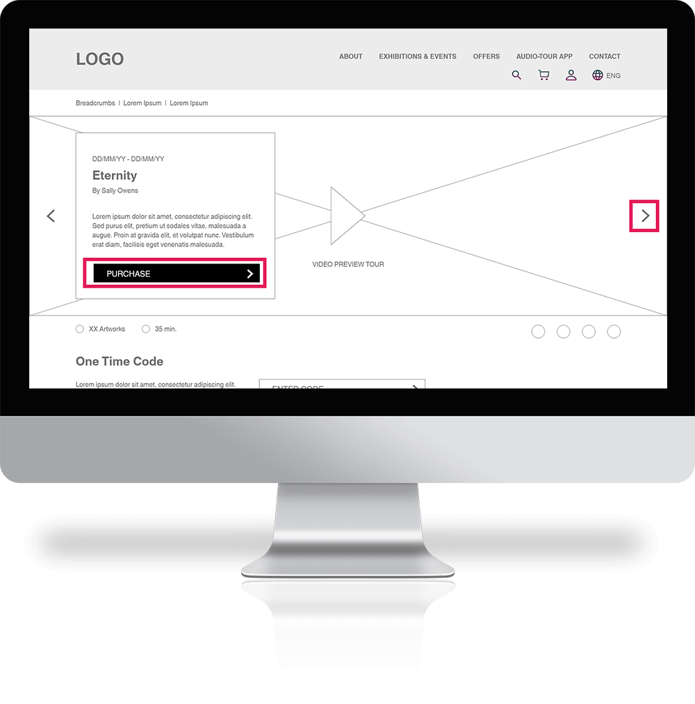
Easy navigation was a key user need to address in the designs in addition to equipping the app to work with assistive technologies. Also, a Preview Video of the tour can help the user to better understand the product and the “Purchase” button makes it fast and easy to purchase it.
Straightforward flow and the cues for navigation to be clearly indicated was essential for users to complete the tasks easily and confidently.
Lo-Fi Prototype
The Lo-Fi Prototype connected to the primary user flow of navigating the website, choosing a tour (Eternity) and make a purchase, so the prototype could be used in a usability study with users.
Usability Study
Findings
Participants didn’t understand the function and the purpose of some buttons, due to their naming.
Participants didn’t notice or use some of the features.
The hierarchy of the content should be enhanced.
Chevrons should be placed more thoughtfully according to their functionality.
Refining the Design
Design Iterations
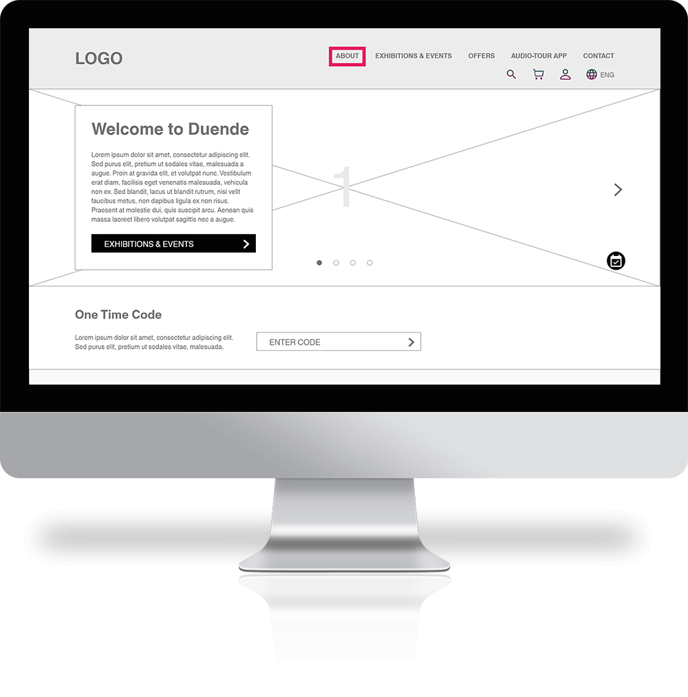
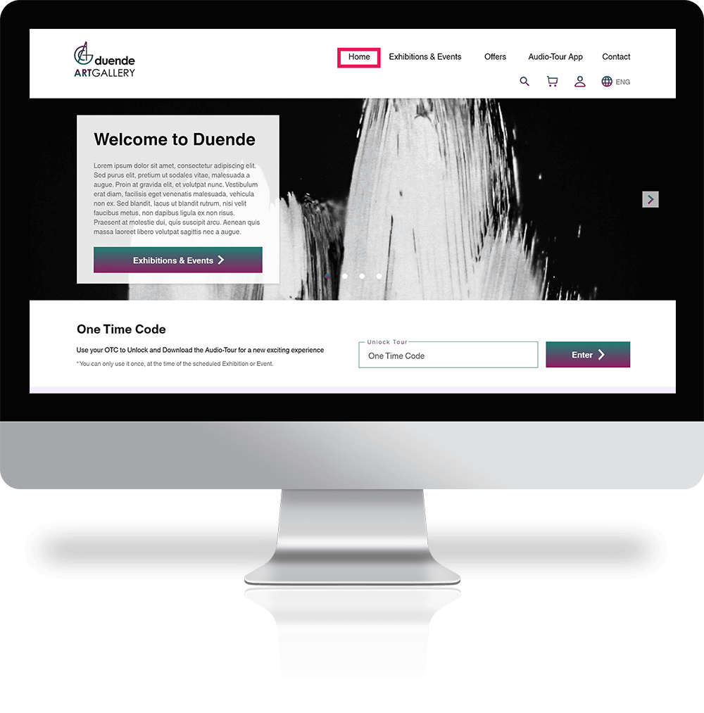
Based on the insights from the Usability Study, I made changes to some buttons, so as to improve the user’s interaction and navigation flow. One of the changes I made was to rename the “About” button from the navigation menu into “Home”.
Early designs offered some good features but the flow was confusing. To make it more clear for the user, I gave it some more thought concerning hierarchy. Some of the changes I made were the “Purchase” button’s position and the addition of one more button leading to the next Exhibition/Event.
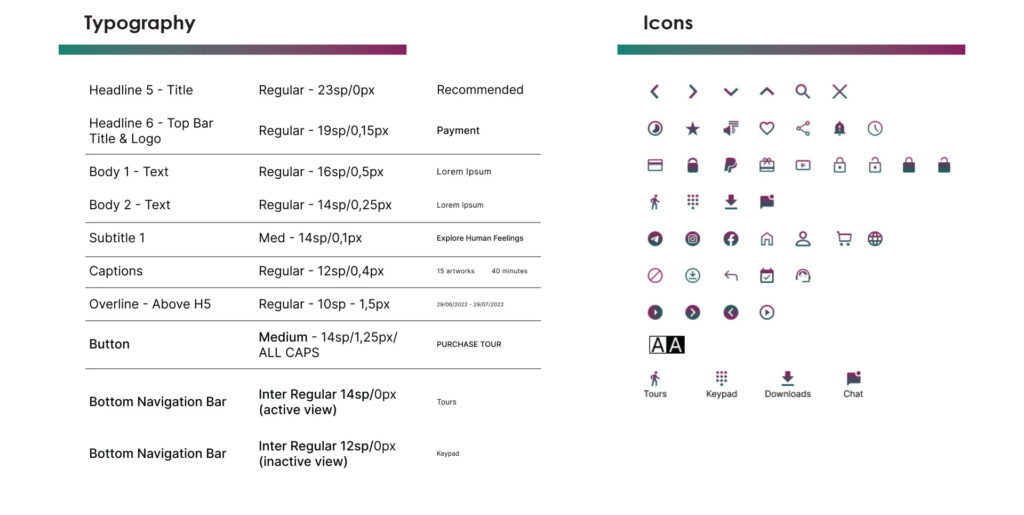
Style Guide
A simple, yet modern style was the main goal to achive when building the Brand’s Identity.Clear lines in Logo & Visual Design, simple and legible Typography, and unisex Colors carefully chosen according to the WCAG A and WCAG AA specifications and Contrast Ratio.
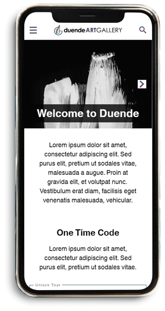
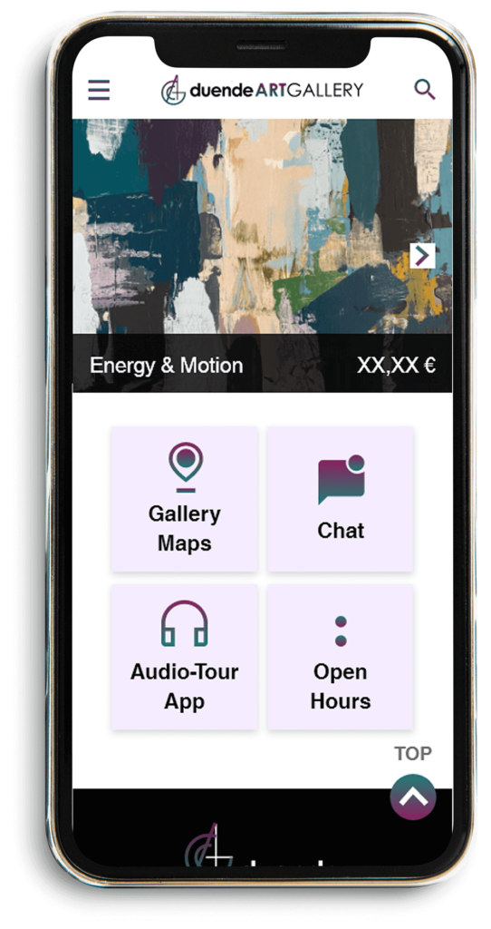
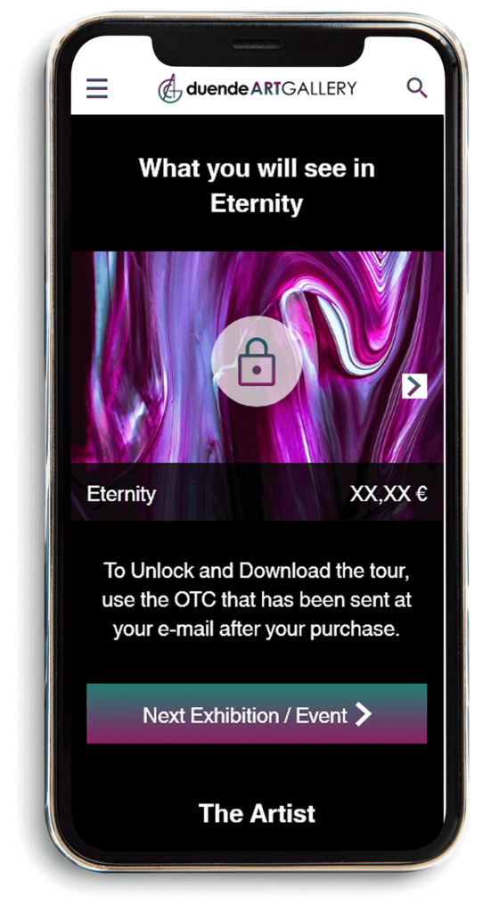
Final Mockups + Screen Size Variations
High Fidelity Prototype
My Hi-Fi Prototype followed the same user flow as the Lo-Fi Prototype, and included the design changes made after the usability study, as well as several suggested by members of my team.
Accessibility Considerations
I used headings with different sized text or clear visual hierarchy.
I used landmarks to help users navigate the site, including users who rely on assistive technologies.
I designed the site with alt text available on each page for smooth screen reader access.
Impact
Our target users shared that the design was appealing and motivating, pretty intuitive to navigate through, more engaging with the images and the flow, and demonstrated a clear visual hierarchy.
It is rather essential to me to focus on the real needs of the user when coming up with design ideas and solutions.
What I learned
I leared that even a small design change can have a huge impact on the user experience. Another important finding for me was to never underestimate feeback.
Possible Next Steps
Conduct follow-up usability Study on the Website.
Conduct follow-up usability Study on the Website.
Category
Case Study, QA Tester, UX Design
Tags
case study, graphic design, responsive, UX Design, visual design, website