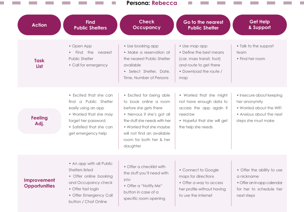
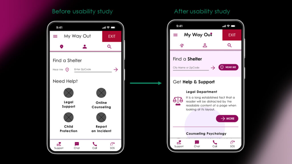
About This Project


The Product

I am developing a dedicated App and a fully responsive Website for women who are victims of domestic abuse, through which they can search, find and reserve a room in a Shelter when in an emergency and/or book an appointment with a Legal Team for any advice.


Target Audience

Women who live in Greece and who are victims of domestic abuse.

This product also addresses to all women with different marital status, abilities, educational level and/or occupations and industries, as its main goal is not only to help them practically, but also inform and support them psychologically.


My Role

• UX Designer • UX Researcher • Leading the My Way Out Website Design


My Responsibilities

• Conducting Interviews • Do User Research
• Create Personas • Build Problem Statements • Create User Journey Map • Wireframing • Designing Mockups
• Lo/High Fidelity Prototyping • Conducting Usability Studies
• Iterating on Designs • Information Architecture
• Responsive Web Design


The Goal

The intention of this product is to inform and help women who are victims of domestic abuse. It offers a way to reserve a room for the night or/and take legal advice. It also aims to make all women feel secure and supported.


Challenges

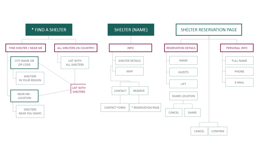
Women often become victims of any type of abuse. Most of the times this happens in their close environment and they are forced to leave home. There are many Shelters that offer help, but there’s no way to reserve a spot there easily and quickly, so as not to search all over the city.

Design Process

During this multi-stage process I tried to ensure that the project meets quality and consistency standards and that my designs offer unbiased solutions. Several tests and iterations took place to find the best viable options while identifying hidden risks and opportunities.

Empathize Define

User Research

User Interviews

Personas

Empathy Maps

User Journey Maps

Ideate

User Flow

User Stories

Storyboarding

Site Map

Info Architecture

Design

Wireframes

Visual Design

Lo-Fi Prototypes

Hi-Fi Prototypes

Test

User Research

Usability Studies

Feedback

Insights

Design Iterations

Empathize & Define

User Research

I conducted interviews and created empathy maps to understand the users I’m designing for and their needs. The participants for this research were people of different age, educational level and economic status. People with disabilities or other daily obstacles were also taken into consideration.

All participants have been victims of domestic abuse or any type of harassment at some point in their life. All of them reported that they don’t feel safe enough that they will be able to get help if need be.  The feedback received through research made it very clear that users would be open to an easy-to-use tool in order to find and book a room at a Shelter in case of emergency.

Interview Questions

Can you describe your current schedule and how you balance your responsibilities with your personal life?

Have you ever felt threatened by your partner or a member of your family? What challenges have you faced when you felt that way? Is there any way in which you feel these challenges could have been resolved?

What would you probably do if you felt threatened or intimidated by your partner or a member of your family?

Where would you possibly go in case of emergency? Is there a specific person you would turn to if need be?

Which device do you think it would be easier to use or you would likely have access to in case of emergency?

What are your main concerns if you happen to be in a predicament like this?

Personas

User Stories

User Journey

Competitive Audit

I searched for similar applications and websites that serve the same cause to help me gain a better understanding of the direct and indirect competitors.

An important finding during my research was that no other similar product had a room or an appointment scheduling feature like the one I was about to design. In order to prioritize my goals and the future development I observed the strenghts, the weaknesses but also the gaps and the opportunities that rised from the competition.


Ideation

Crazy 8s

I did a quick ideation exercise to come up with ideas for how to address gaps identified in the competitive audit. My focus was specifically on quick booking either a room or an appoinment features.

Initial Concepts

Big buttons in home screen

FAB for online chat

Search: List with Drop Down Menu​

Big search with chips​

Call me Back button​

Carousel for search

Recommended actions​

Big Button for legal Department in the footer​

SOS button: Send your contact info and location to a friend

Save shelters to favorites​

Big screens in public streets displaying / demonstrating the App​

Search via GPS and current location​

Maps with all available shelters​

Carousel with available shelters right now​

Search bar in homepage​

I evaluated all of my initial concepts considering users’ core needs, and moved forward with those marked with a star.

Design

Paper & Digital Wireframes

After ideating and drafting some paper wireframes, I created the initial designs for the “My Way Out” App. These designs are focused on finding and booking easily and quickly a room at a Shelter or an appointment with the Legal Team.

To prepare for usability testing, I created a low-fidelity prototype that connected the user flow of searching, finding and make a reservation for a room at a Shelter, or booking an appointment with the Legal Team.


[in Figma]
Low Fidelity Prototype

Usability Study

Parameters

Study type:

Unmoderated + Moderated usability study

Location:

Greece, remote

Participants:

5 participants

Length:

15-20 minutes

Findings

Some of the main navigation buttons weren’t working well.​

“Near Me” and “Enter Zip Code” didn’t look like they were 2 different options.

“Near Me” and “Enter Zip Code” didn’t look like they were 2 different options.

Refining the Design

Mockups

Based on the insights from the usability studies, I applied design changes like making the “Find a Shelter” section more prominent. Additional design changes included indicating more clearly the Legal Department.

Style Guide

For the Logo Design I used clean, legible Typography with only a little circle as a representation of the woman symbol. 

In all Visual Elements I created a feminine color palette, and carefully chose all colors according to the WCAG A and WCAG AA specifications and Contrast Ratio.

My main purpose was to make women in a predicament not to feel like misfits, but encouraged to talk and seek help.


Test

High Fidelity Prototype

The high-fidelity prototype followed the same user flow as the low-fidelity prototype, including changes, made after the usability study.


[in Figma]
Hi Fidelity Prototype


Responsive Web Design

Sitemap

With the App designs completed, I started work on designing the Responsive Website. I used the “My Way Out” Sitemap to guide the organizational structure of each screen’s design to ensure a cohesive and consistent experience across devices.
 
The designs for screen size variations included mobile, tablet and desktop. I optimized the designs to fit specific user needs of each device and screen size.
 

Accessibility Considerations

Clear labels for interactive elements that can be read by screen readers.

Initial focus of the home screen on personalized recommendations help define the primary task or action for the user.

All color styles are carefully chosen and used according to the WCAG specifications and contrast ratio.

Impact

Users shared that the app helped them feel more secure and that it could really help them in case of emergency. One quote from peer feedback was “Wow! I’m impressed! I never thought an app like this could be so user friendly! Apart from the overall experience, I also appreciate the designer’s struggle.”

What I learned

I learned that even though the problem I was trying to solve was a big one, diligently going through each step of the design process and aligning with specific user needs helped me come up with solutions that were both feasible and useful.

Possible Next Steps

Conduct research on how successful the app is in reaching the goal to find and book a Shelter for the night and/or schedule an appointment with the Legal Team.

Add more educational resources for women to learn about abuse and ways to get help.

Provide incentives for women to talk about their experience and not to be afraid of seeking help.

every project is heavenly created with love by sofia angelou
Category
Case Study, QA Tester, UX Design
Tags
app, application, qa, quality assurance, responsive, UI Design, UX Design, visual design, website